Accounting
Anthropology
Archaeology
Art History
Banking
Biology & Life Science
Business
Business Communication
Business Development
Business Ethics
Business Law
Chemistry
Communication
Computer Science
Counseling
Criminal Law
Curriculum & Instruction
Design
Earth Science
Economic
Education
Engineering
Finance
History & Theory
Humanities
Human Resource
International Business
Investments & Securities
Journalism
Law
Management
Marketing
Medicine
Medicine & Health Science
Nursing
Philosophy
Physic
Psychology
Real Estate
Science
Social Science
Sociology
Special Education
Speech
Visual Arts
Question
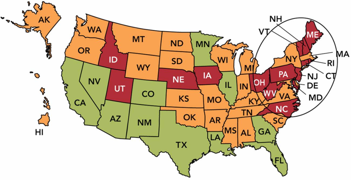
UMD9: Marketing Dashboard Map
In the UMD9: Marketing Dashboard Map above, the annual growth rate in each state is shown, with green (which looks gray on printed paper) meaning good and red (which looks black on printed paper) meaning very poor. If you were a marketing manager faced with this dashboard, which of the following would be the best action?
A. Focus on the shortfalls in Idaho (ID) and Utah (UT).
B. Revise the relevant goals for both east and west coast.
C. Conduct additional market research in the southern United States.
D. Examine your distribution system in the northeastern United States.
E. Change the marketing metric being used to evaluate the states individually.
Answer
This answer is hidden. It contains 307 characters.
Related questions
Q:
__________ of all new businesses fail within five years of their launch.A. Only 5 percentB. Only 10 percentC. Only 25 percentD. About 40 percentE. Over 50 percent
Q:
The functional level in an organization is whereA. groups of specialists actually create value for the organization.B. employees perform assigned tasks without actually having input into the decision making process.C. all financial outlays are made.D. all company hiring and firing occurs.E. the strategic planners in SBUs makes all decisions regarding which product benefits will be promoted during a promotional campaign.
Q:
The strategic business unit levelA. works most directly with the organization's target customers.B. directs the overall strategy for the organization.C. is most likely to change substantially over time.D. provides more end-user analysis in order to design more customer-directed products.E. is the level at which managers set a more specific strategic direction for their businesses to exploit value-creating opportunities.
Q:
The __________ element of the marketing mix includes channels and transportation.A. productB. priceC. promotionD. placeE. people
Q:
The __________ element of the marketing mix includes discounts and allowances.A. productB. priceC. promotionD. placeE. people
Q:
Figure 2-1In Figure 2-1 above, Box A represents theA. functional level.B. board of directors.C. corporate level.D. CEO.E. strategic business unit level.
Q:
Points of difference refer toA. the fundamental, passionate, and enduring principles of an organization that guide its conduct over time.B. the cluster of benefits that an organization promises customers to satisfy their needs.C. a unique strength relative to competitors that provides superior returns, often based on quality, time, cost, or innovation.D. those characteristics of a product that make it superior to competitive substitutes.E. the use of percentage points of market share to allocate marketing resources effectively for different product lines within the same firm.
Q:
According to the textbook, the terms firm, company, and organizationA. refer to for-profits, non-profits, and government agencies respectively.B. refer to non-profits, government agencies, and for-profits respectively.C. refer to government agencies, for-profits, and non-profits respectively.D. refer to for-profits, government agencies, and non-profits respectively.E. can be used interchangeably to cover both profit and nonprofit organizations.
Q:
Market segmentation refers toA. identifying small groups of customers with dissimilar needs.B. aggregating prospective buyers into groups and selecting only those whose needs cannot be met by competitors' products.C. aggregating prospective buyers into groups that have common needs and will respond similarly to a marketing action.D. aggregating different products into more reasonable product groupings to better serve consumers' needs.E. those characteristics of a product that make it superior to competitive substitutes.
Q:
Figure 2-7Quadrant A in Figure 2-7 above represents a(n) __________ in a SWOT analysis.A. ThreatB. WeaknessC. StrengthD. OpportunityE. Market segment
Q:
Which statement best describes the most significant difference between a for-profit organization or a business firm and a nonprofit organization?A. Business firms operate with larger budgets than nonprofits.B. Nonprofit organizations do not carry on economic activities while business firms do.C. Nonprofit organizations are concerned with social issues and business firms are not.D. Both serve customers, but business firms seek a profit while nonprofit organizations do not.E. Nonprofit organizations are publicly owned and business firms are privately owned.
Q:
According to the textbook, Target has been successful by offering consumers the bestA. experience.B. products/services.C. customer service.D. availability.E. price.
Q:
The five major environmental forces in a marketing decision areA. climate change, natural resources, pollution, natural disasters, and global conflict (war).B. social, technological, economic, competitive, and regulatory.C. corporate ownership, internal management, supplier partnerships, strategic alliances, and customer relationships.D. product, price, promotion, place, and people.E. ethics, sustainability, cultural awareness, diversity, and values.
Q:
Which of the following is NOT an environmental force?A. technologicalB. regulatoryC. ecologicalD. competitiveE. economic
Q:
The marketing mix refers toA. the selection of product benefits and attributes that are to be added to or subtracted from a given product to create variations within a product line.B. the specific ratio within a budget that divides resources between advertising, sales promotion, and personal selling.C. the marketing manager's controllable factors - product, price, promotion, and place - that can be used to solve a marketing problem.D. the allocation of resources within a firm towards individual marketing programs.E. the environmental forces - social, economic, technological, competitive, and regulatory - that impact the marketing decisions for a particular product at any given time.
Q:
A target market refers toA. people who could purchase a product regardless of who ultimately uses it.B. one or more specific groups of potential consumers toward which an organization directs its marketing program.C. former customers who now use competitors' products.D. the cluster of benefits that an organization develops to satisfy consumers' needs.E. people with both the desire and the ability to buy a specific offering.
Q:
Figure 1-2In Figure 1-2 above, "B" is accomplished by __________.A. designing a marketing programB. conducting marketing researchC. discovering consumer needsD. developing a distribution strategyE. identifying target markets
Q:
Hot Pockets Sandwich PhotoA television advertisement shows several teenagers searching through the refrigerator for something to satisfy their hunger. The refrigerator offers the teenagers many alternatives - celery, bologna, cottage cheese, and box of Hot Pockets Bacon Cheddar Cheese Melt sandwiches (see the photo above). The ad, which shows the teens happily selecting the Hot Pockets sandwiches, appeals to the consumers' __________ for sustenance to satisfy their hunger and attempts to shape their __________ for the advertised product.A. needs; wantsB. wants; needsC. wants; cravingsD. cravings; needsE. needs; preferences
Q:
A need refers toA. a sense of personal inadequacy based upon observations by others around you.B. a sense of urgency, which causes a person to take action.C. a feeling that is shaped by a person's knowledge, culture, or personality.D. a feeling of being deprived of something, but not fully understanding what it may be.E. a situation when a person feels deprived of basic necessities such as food, clothing, and shelter.
Q:
The first objective in marketing is to discover consumers' __________.A. diversity of opinion to create advertising messagesB. income to determine the most lucrative price point for a productC. lifetime value of an offering to the organizationD. characteristics that would be useful to segment marketsE. needs to create products that could satisfy them
Q:
A student would like to buy cross-over SUV from a local dealer, but she thinks the payments will be too high. Marketing does not occur in this situation becauseA. two or more parties have unsatisfied needs.B. there is no desire on the part of either party to satisfy its needs.C. one of the involved parties does not have the ability to satisfy its needs.D. there is no way for each party to communicate with one another.E. there has been no assessment of consumer wants and needs.
Q:
Which of the following conditions are necessary for marketing to occur?A. a changing environment, a method of assessing needs, a way to communicate, and an exchange locationB. parties with cash or credit, a product, a reasonable price, and a place to make an exchangeC. a quality product, a fair price, a clever method of promotion, and a place where a customer can buy the productD. two or more parties with unsatisfied needs, a desire and an ability to satisfy them, a way to communicate, and something to exchangeE. an ability to see a trend within an environmental force, a product, and an affordable and actionable advertising campaign
Q:
Profit refers toA. the point at which a company's assets equal its liabilities plus shareholder equity.B. the difference between the list and final price of a product or service.C. the money earned when the economic order quantity is minimized.D. the money left over after a business firm's total expenses are subtracted from its total revenues.E. the total amount of revenue accrued through product sales or service distribution.
Q:
The acronym SWOT, as in SWOT analysis, stands for __________.A. strengths, weaknesses, opportunities, and tacticsB. strengths, weaknesses, options, and tacticsC. strengths, weaknesses, opportunities, and threatsD. simple, workable, optimal, and timelyE. state the problem, work out a strategy, organize your team, and take action
Q:
The Apple iPhone is rated by Consumer Reports as being one of the best smartphones in the industry. Define customer value. In what ways do you think the Apple iPhone provides value for its customers?
Q:
All of the following current or prospective distribution channels for Chobani Greek Yogurt EXCEPT:A. convenience stores.B. drug stores.C. mass merchandisers.D. supermarkets.E. vending machines.
Q:
Innovators at 3M developed Scotchbrite Greener Clean scrub sponges from spiky agave plant leaves. Customers appreciate this superior product (they don't rust or scratch) and like the fact that their purchase is environmentally responsible, making this an example ofA. the societal marketing concept.B. the marketing concept.C. consumerism.D. target markets.E. capitalism.
Q:
While many commercials that use humorous appeals gain the attention of the audience, they
A. are most effective because they work so well for global campaigns.
B. contain no information to help consumers.
C. do not appeal to either men or women.
D. wear out quickly, boring the consumer.
E. don't appeal to the Generation Y cohort.